
Benjamin Moore’s Classic Gray and Silver Satin are the most popular neutral home paint colors. With their subtle, sophisticated hues, these shades are ideal for creating a relaxing and elegant backdrop in any room. But what exactly sets them apart, and how do you choose between them?
This in-depth comparative analysis will explore all the nuances, from undertones and light reflectance to real-world applications across different spaces. Read on for an insightful overview before you make your final Benjamin Moore paint selection.
Neutral Hues with Strong Appeal
Neutral paint colors dominate the interior design landscape, especially shades of gray and greige (a mix of gray and beige). They provide a versatile base that allows other accents and furnishings to take center stage. Among the most sought-after neutrals from Benjamin Moore are Classic Gray and Silver Satin.
Classic Gray, a warm mid-tone gray, has grown in popularity over the past decade. Its versatility enables it to blend seamlessly into color schemes of all styles. On the other hand, Silver Satin is a cooler toned counterpart, bringing a more contemporary edge. Its pale gray appearance adapts well to modern and minimalist spaces.
While both paints are neutral grays, there are discernible differences between Classic Gray and Silver Satin. This article will compare the two Benjamin Moore favorites across various criteria. Read on for an in-depth examination of everything from undertones and LRVs to real-world applications across diverse home interiors.
Visual Characteristics and Emotional Impressions

Before delving into the nitty-gritty details, let’s briefly examine some of the overall distinguishing traits of Classic Gray and Silver Satin.
Classic Gray: Subtle Warmth and Versatile Appeal
Classic Gray is a quintessential greige – displaying subtle hints of beige and taupe that warm up its gray foundation. It sits right in the middle of the neutral spectrum, straddling both cool and warm undertones. The versatility of Classic Gray enables it to complement color schemes of varying palettes and styles. It brings a gentle warmth that feels relaxed yet elegant.
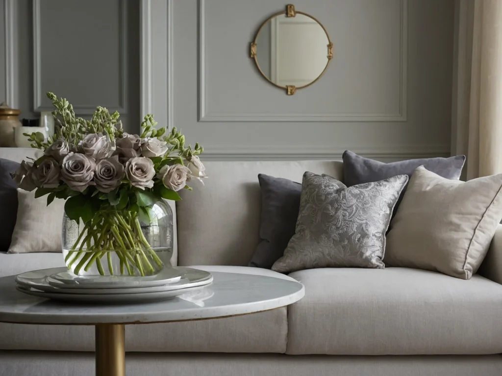
Silver Satin: Crisp, Cool Sophistication
Silver Satin lives up to its name with a beautifully smooth, satin finish. It is decidedly cooler in tone than Classic Gray, coming across as a true pale gray rather than a greige hybrid. The lighter silver undertones lend a sense of refinement and sophistication. Silver Satin evokes a more formal, stylish aesthetic versus the laidback coziness of Classic Gray.
Comparative Analysis: Color Tone and Undertones
Now let’s look at how the undertones and color characteristics differ between Classic Gray and Silver Satin. This will help you select the best shade for your overall style and vision.
Classic Gray: Subtle Beige and Greige Undertones

The first thing to note about Classic Gray is its warm, greige undertone. Slight inflections of beige and taupe influence the gray base. This results in a harmonious marriage between cool and warm – allowing Classic Gray to complement both ends of the color spectrum. The warmth comes across as subtle and gentle rather than overpowering.
Silver Satin: Crisp, Pale Gray Characteristics

In contrast to Classic Gray’s hybrid qualities, Silver Satin appears as a true, pale gray. Its undertones are decisively cooler and lack any prominent traces of beige or taupe. Instead, Silver Satin conveys a sense of sophistication with its interplay between soft gray and barely perceptible hints of blue and green. Overall, the coolness of Silver Satin lends itself beautifully to modern environments.
Undertone Analysis
To recap the key differences in undertones:
- Classic Gray is inherently warmer due to faint beige and greige hints. This allows it to bridge warm and cool color schemes.
- Silver Satin possesses a crisp, pale gray appearance without strong warm undertones. Its primary traits are cool, subtle blue and green casts.
The undertones in these Benjamin Moore paint colors will guide you in selecting a shade tailored to your decor style. Classic Gray aligns well with transitional palettes, while Silver Satin suits modern spaces with a monochromatic scheme.
Light Reflectance Value (LRV) Comparison
Another distinguishing factor between Classic Gray and Silver Satin is their light reflectance value (LRV). The LRV indicates how much light a color reflects, measured on a scale of 0 (pure black) to 100 (pure white). LRV strongly influences the ambiance of a space.
Classic Gray: LRV of 63

With an LRV of 63, Classic Gray reflects a moderately high amount of light. This prevents it from appearing too sad or dark. An LRV of 63 enables Classic Gray to open up smaller rooms and make them feel more spacious. The reflectiveness also keeps the color from dominating when used alongside vivid accent hues.
Silver Satin: LRV of 79

Silver Satin has a significantly higher LRV of 79. The pale gray tone allows it to reflect even more light for an airier, ethereal effect. An LRV approaching 80 conveys a sense of openness and breathability. Silver Satin won’t overwhelm other elements but instead lets accent colors shine.
Spatial Impact

A higher LRV paint color like Silver Satin can make rooms feel larger and more inviting. Meanwhile, Classic Gray’s mid-range LRV brightens up a space without nearing the starkness of a true white. Select Silver Satin for small rooms needing illumination or Classic Gray for a balance of light and coziness.
Adaptability in Different Lighting Conditions
The lighting in a room dramatically impacts how a paint color is perceived. Here’s how Classic Gray and Silver Satin compare when illuminated under diverse lighting scenarios:
Classic Gray: Chameleon-Like Adaptability

One of Classic Gray’s strengths is its adaptability under different lighting effects. In bright, sunlit rooms, the beige undertones come forward to impart a warmer sensibility. As natural light fades, Classic Gray takes on a truer gray appearance. Under artificial lighting, the greige characteristics emerge again to prevent a flat, cold impression. Overall, the subtle dual nature makes Classic Gray highly versatile.
Silver Satin: Potential Challenges in Darker Rooms

With its higher LRV and crisp, pale gray tone, Silver Satin thrives in well-lit spaces. Abundant natural light plays beautifully off its soft sheen. However, Silver Satin may come across as too cool and stark in rooms with minimal sunlight or artificial lighting. The pale gray risks seeming flat and almost institutional without sufficient illumination. Be mindful of lighting when opting for a lighter shade like Silver Satin.
Lighting Recommendations
- Classic Gray – Adaptable to varied lighting but best complemented with ample natural light to harmonize its warm and cool facets. Avoid very dim conditions.
- Silver Satin – Requires bright, consistent lighting from windows and fixtures to prevent a flat appearance. North-facing rooms may not show its true color.
Choose Classic Gray for rooms with fluctuating light. For consistently well-lit areas, Silver Satin shines.
Room Suitability and Functionality
Benjamin Moore’s Classic Gray and Silver Satin also differ significantly in terms of which rooms they work best in. Consider room functionality and color scheme when deciding between the two hues.
Classic Gray: Busy, Colorful Spaces

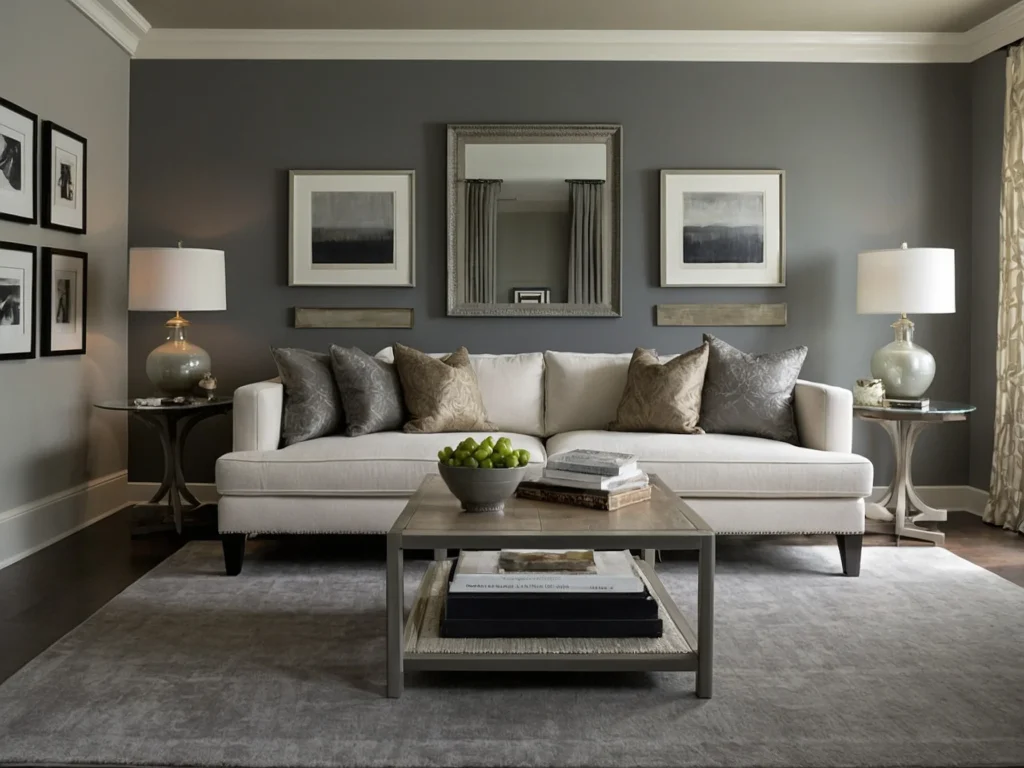
Thanks to its versatile beige-gray blend, Classic Gray is an ideal neutral backdrop for busier spaces with a lot of activity and wear. Its warmth and mid-range depth provide grounding when combined with bold, expressive accent colors and varied textures. Kitchens, family rooms, home offices, and children’s spaces benefit from Classic Gray walls’ lively yet composed vibe.
Silver Satin: Serene, Minimalist Environments

The cool tranquility of Silver Satin makes it optimal for serene, orderly spaces centered around relaxation and simplicity. Bedrooms, spas, reading nooks, and formal dining rooms flourish with Silver Satin walls providing a peaceful ambiance. Its soft, pale gray lets accent details pop while maintaining an uncluttered aesthetic. Silver Satin promotes slow living and introspection.
Room Functionality
- Classic Gray – High-traffic spots and colorful, informal spaces
- Silver Satin – Low-activity areas and pared-down, subdued interiors
Match your Benjamin Moore shade to the functional purpose served by the room.
Color Coordination and Schemes
Beyond room suitability, Classic Gray and Silver Satin each lend themselves to particular color pairings and schemes. Here are complementary combinations to consider.
Classic Gray Color Pairings

Some colors that work beautifully with Classic Gray include:
- Cream and antique white – accentuate the subtle warmth
- Blues and greens – underscore the greige-gray base
- Terracotta and mustard yellow – add vibrancy to balance the neutral backdrop
- Dark wood tones – provide depth through layered, textural contrast
Overall, Classic Gray’s versatile, greige nature enables it to coordinate seamlessly with Its beige-gray essence harmonizes in an endless variety of settings.
Silver Satin Color Pairings

To allow Silver Satin’s light gray qualities to shine, pair it with colors that complement its inherent coolness:
- Crisp whites and pale pastels – accentuate the airy tranquility
- Grays, blues, and greens – maintain a monochromatic color flow
- Metallics like silver, pewter, and chrome – echo the sophisticated gray tones
- Black and charcoal – inject minimalist contrast into the space
Stick to a cooler-toned color scheme with plenty of white to let Silver Satin emanate its understated elegance.
Harmonious Color Combinations
To summarize key color pairings:
- Classic Gray works across warm and cool palettes, pairing beautifully with beiges, blues, greens, and terracottas.
- Silver Satin shines with cool, muted tones like pale grays, blues, greens, and clean whites.
Choose Classic Gray for diversity and Silver Satin for an upscale monochromatic flow.
Application in Home Decor

Beyond just walls, Classic Gray and Silver Satin can be incorporated widely across home decor elements like trimwork, furniture, and accessories. Here’s an overview:
Trim, Cabinets, Furniture
Both Classic Gray and Silver Satin serve beautifully as trim and cabinet colors. Classic Gray provides pleasant contrast against white walls while matching floors for a cohesive flow. Use Silver Satin on shelves, built-ins, and other trim elements for a bold yet elegant statement.
These colors also translate seamlessly to upholstered furniture and case goods. Classic Gray offers flexibility pairing with wood finishes from ebony to oak. Meanwhile, Silver Satin brings a refined polish to furnishings.
Material Compatibility
In terms of materials, Classic Gray and Silver Satin complement:
- Wood surfaces – floors, cabinetry, furniture
- Tile, granite, and quartz – kitchen/bath backsplashes
- Natural fiber rugs and textiles
- Metallic finishes and hardware
Both integrate splendidly across interior elements for holistic decor harmony.
Practical Considerations
Along with visual appeal, Classic Gray and Silver Satin differ in practical factors like durability and maintenance. This may guide your selection process.
Durability and Maintenance
With its slightly darker shade and beige-gray versatility, Classic Gray offers excellent durability and stain-resistance. Its rounded undertones conceal scuffs and marks, allowing it to weather high-traffic areas. Silver Satin requires more maintenance to prevent stains and scuffs from marring its pale gray surface. Overall, Classic Gray rates higher for long-term wearability.
Cost Analysis
In terms of cost, Classic Gray and Silver Satin retail for around the same price point. Classic Gray may provide greater value for money based on its ruggedness and longevity. However, Silver Satin’s upscale appearance justifies the cost for its intended elegant environments. Choosing between the two comes down to decor goals and color preference rather than price considerations.
User Experiences and Real-Life Applications
Beyond the technical comparisons, examining how Classic Gray and Silver Satin perform in actual home settings is insightful. Here are some real-world perspectives and examples.
Interior Designer Insights
Professional interior designers who often use Benjamin Moore paints in client projects share that:
- Classic Gray works beautifully in family spaces, kids’ rooms, and high-traffic areas where durability matters. Its adaptable hue provides flexibility across homes.
- Silver Satin creates a gorgeous focal point when used on an accent wall in a bedroom or dining area. Its cool tranquility sets a relaxed mood.
Homeowner Testimonials
Individual homeowners who painted their interiors with these shades give the following feedback:
- “Classic Gray complements the warm wood tones in our kitchen and makes the space feel cozy yet stylish. We get compliments from everyone who visits.”
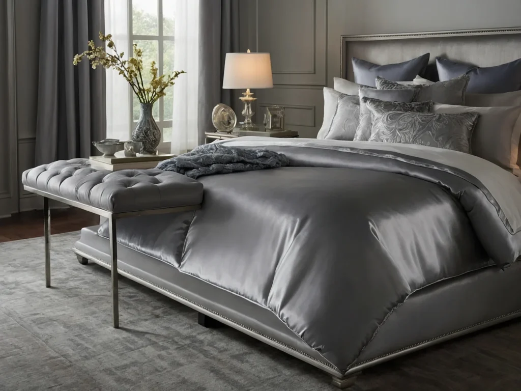
- “I used Silver Satin in our spa-like master bath and it makes the room feel like a dreamy, elegant oasis. Just what I wanted for a relaxing spa ambiance.”
Real-Life Room Examples
Here are some real examples of rooms painted in Classic Gray and Silver Satin:
- Classic Gray on the walls of a beach cottage living room with white trimwork and rattan furniture
- Silver Satin in a minimalist bedroom with light oak floors and metallic decor accents
- Classic Gray on built-in shelving and trim in a transitional kitchen with blue cabinetry
- Silver Satin dining room with a chrome chandelier, marble table, and upholstered chairs
Classic Gray’s versatility and Silver Satin’s elegance shine through across real home interiors.
Is Silver Satin a Grey?
Yes, Silver Satin is considered a true, pale gray without prominent warm undertones. It leans cooler on the spectrum compared to hybrid “greige” shades.
What is Silver Satin Used For?
Beyond wall paint, Silver Satin serves beautifully as an exterior door color. It also brings elegance to trimwork, cabinets, furniture, and ceilings. The soft gray sheen suits a variety of applications.
Conclusion and Final Recommendations
In closing, Classic Gray and Silver Satin offer two sophisticated Benjamin Moore neutral backdrops for your home. Keep the following summary points in mind when choosing between the two:
- Classic Gray provides warm, adaptable versatility for family rooms, kids’ spaces, and high-traffic areas. Its greige-beige undertones offer broad coordinating potential across color schemes and decor styles.
- Silver Satin brings understated, contemporary elegance through its crisp, pale gray tones. It excels in serene settings like bedrooms and formal dining rooms. Cooler undertones allow it to shine through tranquil, monochromatic palettes.
For do-it-all versatility, make Classic Gray your go-to neutral. If seeking an upscale, sophistication, let Silver Satin infuse refined style. You can’t go wrong with these beautiful Benjamin Moore selects.
Additional Questions: