
Neutral paint colors like Classic Gray and White Dove have become popular for modern home interiors. But with so many shades of gray and off-white, how do you know which is right for your space?
This in-depth guide compares Sherwin-Williams’ tried-and-true neutral paint colors, Classic Gray SW 1548 and White Dove OC-17. We’ll analyze everything from undertones and color psychology to real homeowner experiences. Read on to discover the key differences between these gorgeous grays and make an informed decision for your next paint project.
Classic Gray and White Dove
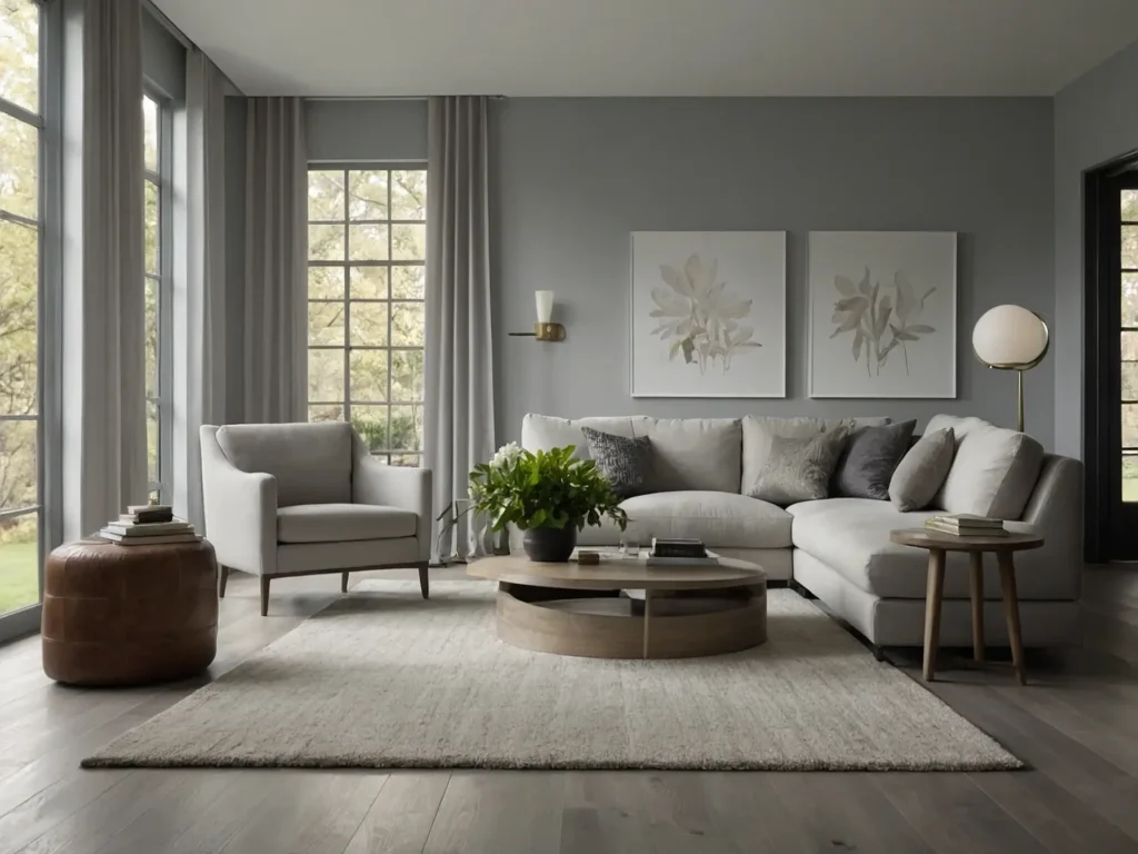
Classic Gray and White Dove are the most sought-after neutral paint colors for residential interiors. Both offer a soft, welcoming look that provides a soothing backdrop for your home. But upon closer inspection, you’ll notice some subtle differences in their undertones and aesthetics.
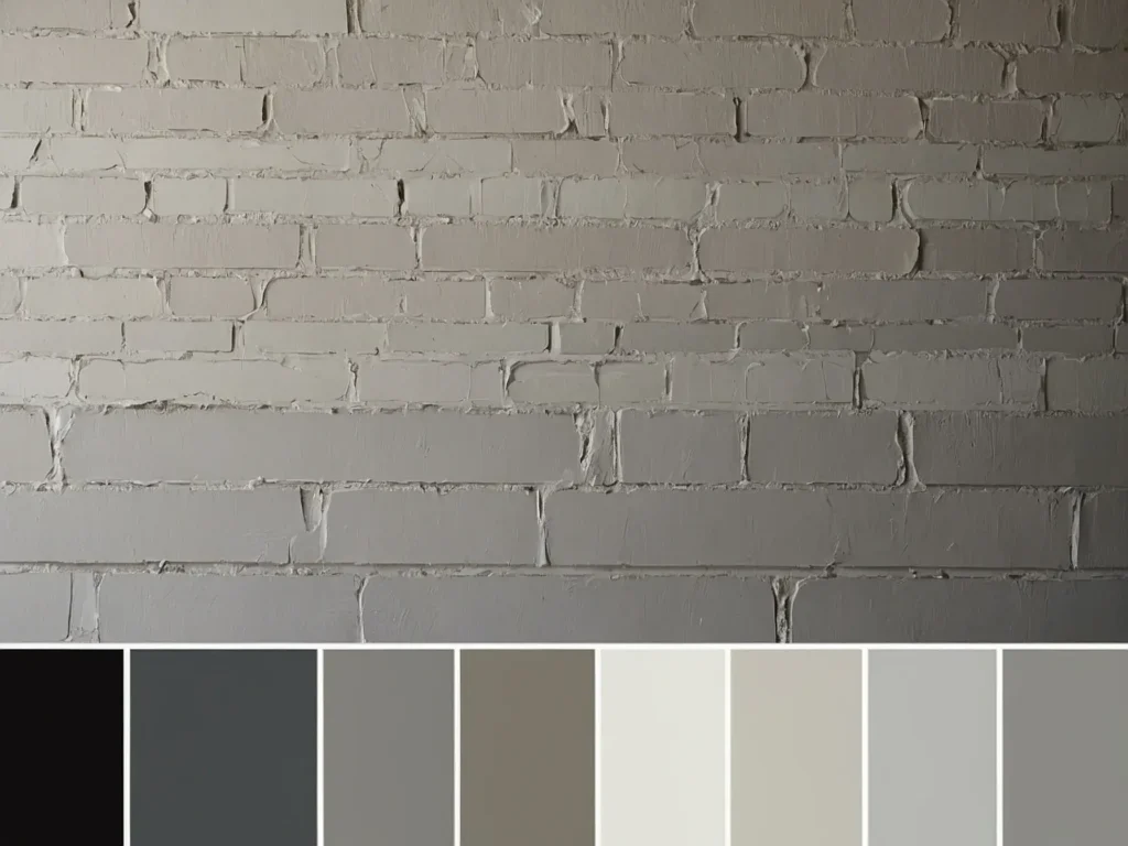
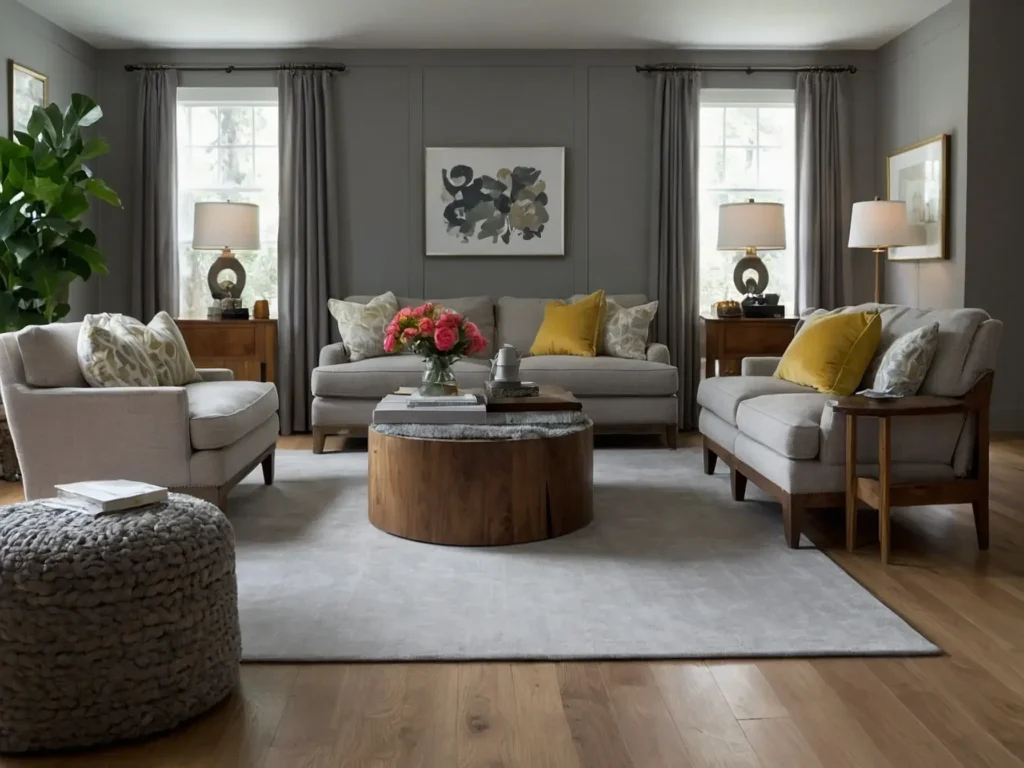
Classic Gray SW 1548 is a light gray with warm, greige undertones. It falls right in the middle of the gray color spectrum—not too dark or too light. A LRV (Light Reflectance Value) 75 reflects a nice amount of light while still providing some contrast against white trim.
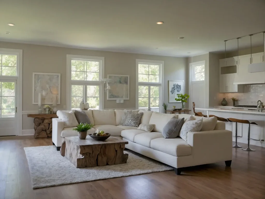
White Dove OC-17 leans slightly more white than gray. It’s off-white with a hint of gray, creating a soft, subtle look. White Dove has a brighter LRV of 82, giving it more contrast next to white.
When choosing between Classic Gray vs White Dove, it helps to think about the overall atmosphere you want to achieve. Do you prefer a cozier, warmer ambiance or a brighter, crisper look? Your lighting conditions, wall colors, and furnishings will also influence how these paint colors appear in your space.
Analyzing the Undertones
The undertones of gray and off-white paint colors can drastically change how they look in your home. Here’s a deeper dive into what gives Classic Gray and White Dove their signature personalities:
The Warm, Greige Undertones of Classic Gray
Classic Gray is often described as a “greige” for its blend of gray and beige. The warm undertones are noticeable, especially in certain lighting conditions. While Classic Gray appears a soft gray in daylight, the beige notes shine through under warm incandescent light. This results in a cozy, welcoming look.
The warm undertones give Classic Gray its versatility to coordinate with different design styles. It provides a nice contrast against cool whites without appearing stark or sterile. The inherent warmth also makes it vibe with natural woods and earth tones.
White Dove’s Subtle Coolness
White Dove is a truer white without overt warm or cool undertones. While many off-whites lean yellow/beige or gray, White Dove strikes a harmonious balance between the two. It’s bright and clean without looking clinical.
You’ll notice White Dove’s barely-perceptible coolness most when placed next to a warmer white. Side by side with Swiss Coffee OC-45, for example, White Dove reads as crisper and brighter. Its LRV is also a touch higher than warmer off-whites.
So while White Dove carries a hint of gray, its overall effect is a soft white that works well among both cool and warm palettes. The subtle gray notes add an airiness that distinguishes it from stark bright whites.
Comparing the Aesthetics
When visualized in a room, Classic Gray and White Dove elicit slightly different styles and moods:
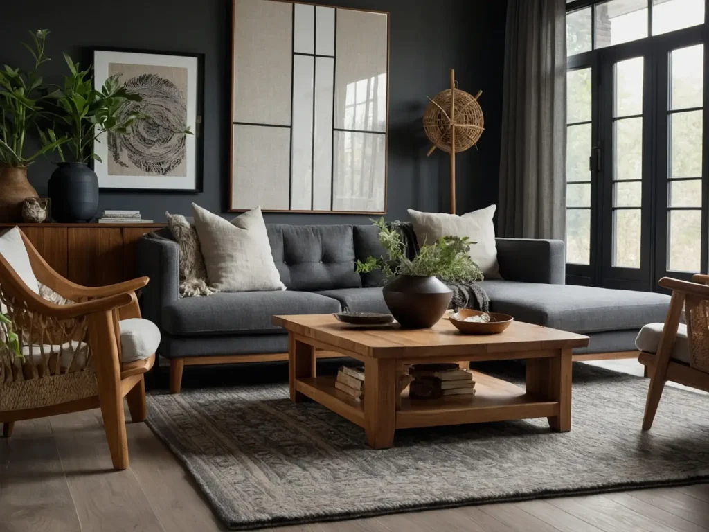
Classic Gray has an inherent coziness and versatility that adapts well to various color schemes. The warmer, greige undertones give it a more relaxed look for casual spaces.
White Dove feels airier and brighter, creating a crisp but soft backdrop. The cooler personality energizes a space without appearing clinical. White Dove leans more polished than everyday grays.
Some key visual differences between Classic Gray vs White Dove:
- Contrast – Classic Gray offers more obvious contrast against crisp white trim/ceilings. White Dove contrasts softly with a seamless transition.
- Lighting Conditions – Classic Gray can read warmer in low lighting but maintains its gray personality. White Dove appears consistent in all light.
- Color Harmony – Classic Gray contrasts more starkly against bright whites. White Dove blends more gently with its inherent softness.
Using Classic Gray and White Dove in Your Home
Now let’s explore how Classic Gray and White Dove work in actual room designs. Here are some common and creative ways to use these colors throughout your home:
Wall and Trim Combinations
A common and chic paint technique is to use an off-white or gray on the walls and bright white for the trim/ceilings. This adds subtle contrast without being jarring.
Classic Gray walls with bright white trim blends seamlessly for a calmer look. The gray walls ground the space while the white trim adds a contrast.
For more vibrancy, White Dove walls make the white trim pop brightly. You still get a cohesive neutral palette, just with more visual interest.
Contrast and Color Harmony
Classic Gray offers more obvious contrast against elements like white trim, which creates a more dynamic look. The gray appears almost moody next to crisp whites.
White Dove provides a softer contrast that blends everything seamlessly. Place it alongside cooler grays and the White Dove is the brighter neutral.
Impacts on Overall Aesthetic
Classic Gray has a tranquil, grounded feel that exudes natural warmth. It’s versatile enough for casual family spaces but also adapts well to more polished rooms.
White Dove delivers a clean, bright backdrop with its true white base. It energizes and opens up a space without appearing clinical. The softness makes it approachable.
Sheen and Texture
Classic Gray and White Dove are available in several Sherwin-Williams finish sheens. A matte or eggshell sheen offers a nice velvety look that stands up to cleaning.
Classic Gray in a flatter finish is a hazy gray with a stoney, mineral appearance. An eggshell or satin sheen adds warmth and luminosity.
White Dove takes on a creamy softness in flat finishes, almost like chalk. Satin or semi-gloss lend it a gentle brightness.
Evaluating Rooms for Each Color
Let’s explore which rooms in your home might be better suited to Classic Gray vs White Dove:
Best Rooms for Classic Gray
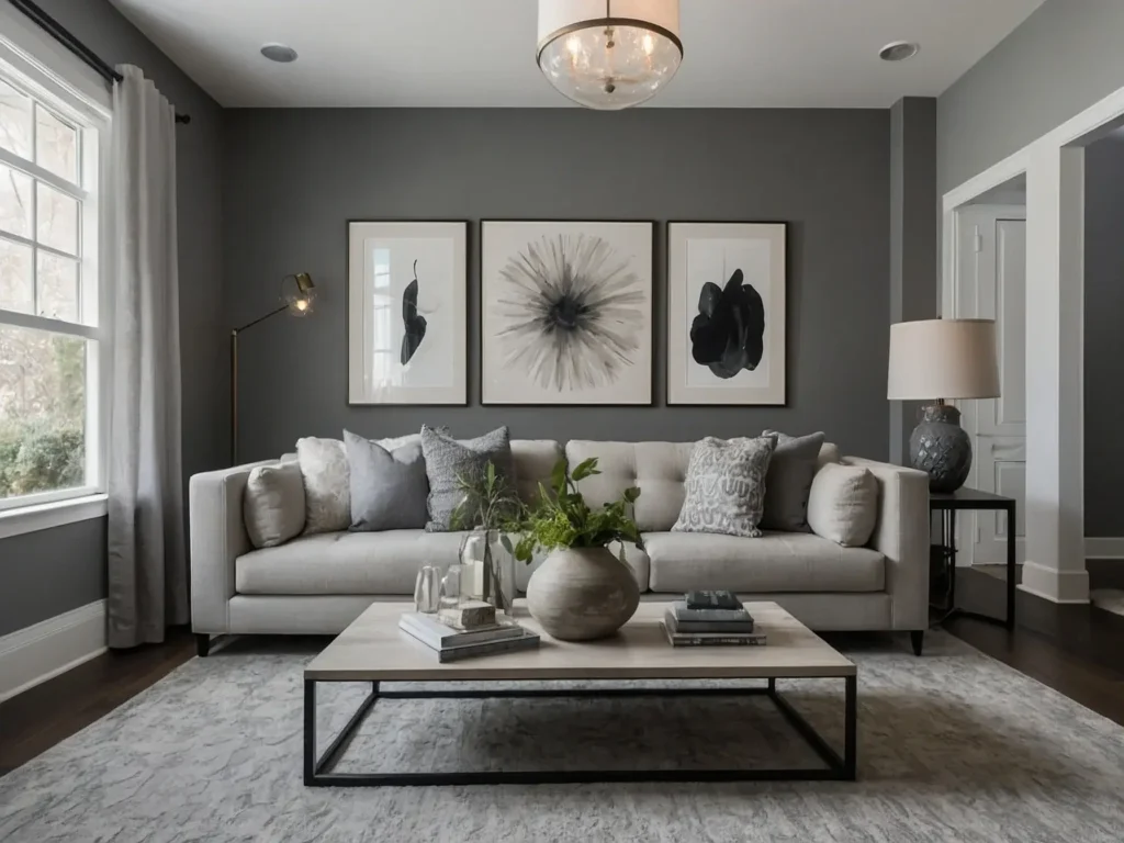
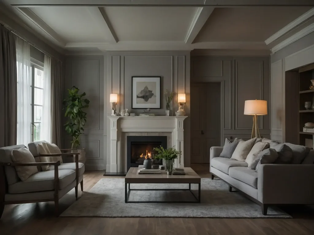
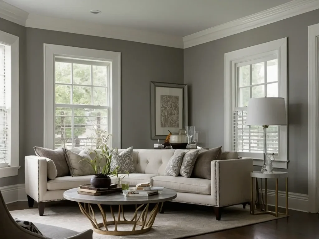
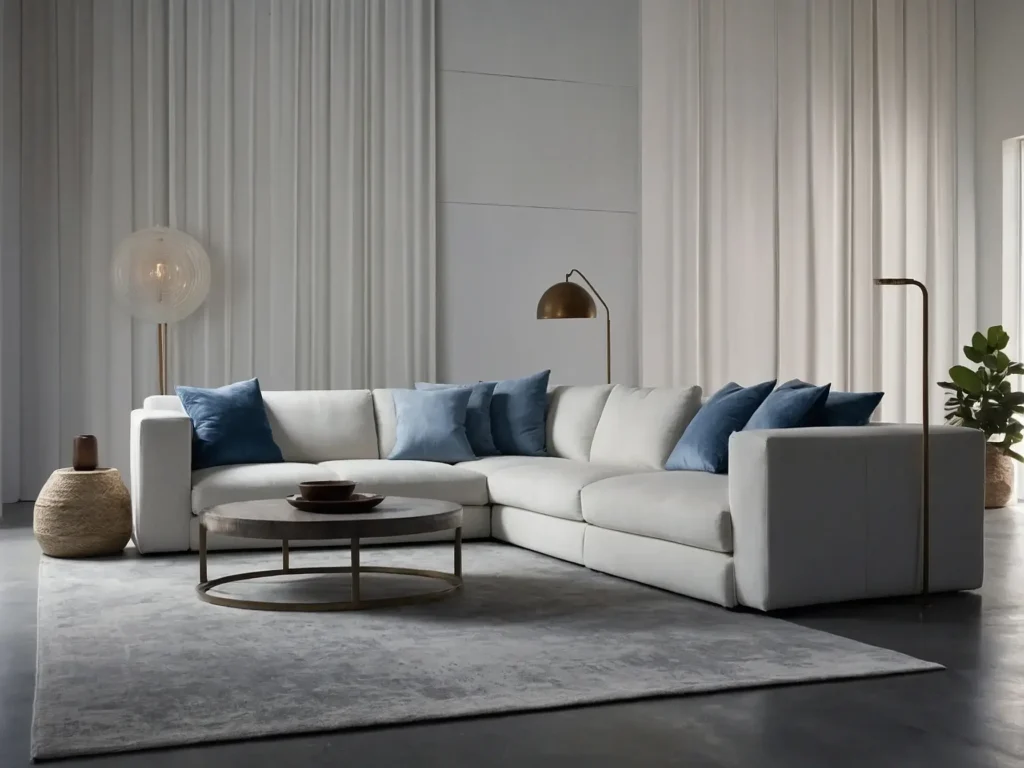
- Living Rooms – Classic Gray creates a relaxed, welcoming living room. The warmth invigorates the space without going too dark.
- Dining Rooms – A light gray dining room palette feels cozy but still polished for entertaining. Classic Gray is versatile enough for formal or casual aesthetics.
- Bedrooms – The softened gray appearance makes bedrooms feel intimate but not too sleepy. Classic Gray adds visual interest without dominating.
- Offices – Classic Gray perfectly balances focus and calm in a home office. It reduces visual noise without feeling oppressive.
Best Rooms for White Dove
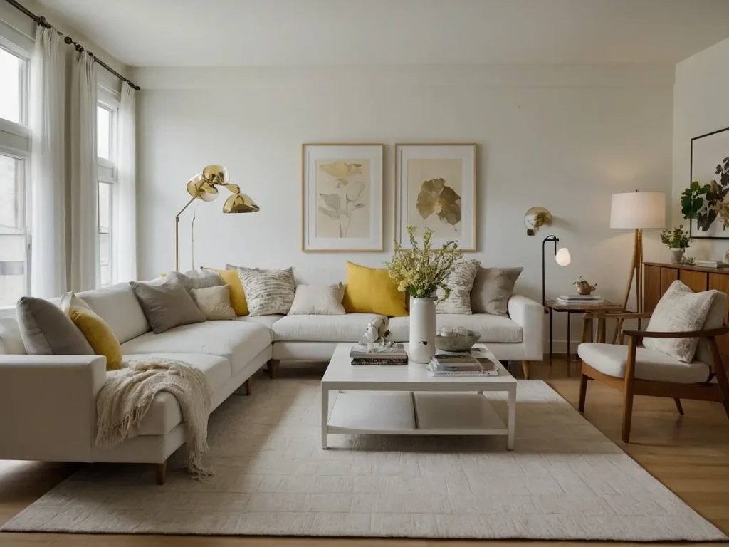
- Kitchens – White Dove gives kitchens a fresh, clean appearance. It reflects light beautifully while minimizing visible cooking messes.
- Bathrooms – White Dove creates a soothing oasis for a brighter, spa-like bathroom. The gray undertones add softness without dinginess.
- Open Floor Plans – White Dove enhances the airy, spacious feeling in wide open great rooms. It opens up the home without starkness.
- Small Spaces – White Dove can make a small space appear larger and more bright. The soft neutrality prevents claustrophobia.
Outdoor Color Considerations
While both Classic Gray and White Dove work beautifully indoors, White Dove has extra durability for exterior house color applications.
White Dove’s brighter white appearance is better than weathering and sun exposure over time. The cooler undertones also resist feeling too warm outside.
Classic Gray would weather more noticeably. Its warmer undertones could also lend a beige-ish cast outdoors. For exterior home color, White Dove is the smarter neutral choice.
Complementary Furniture and Decor
Classic Gray and White Dove are versatile neutrals that play nicely with most furniture finishes and fabric colors. Here are some pairings that bring out the best in each shade:
Classic Gray looks gorgeous with:
- Warm wood tones like oak, walnut, and natural finishes
- Black and wood brown furniture for an earthy feel
- Natural fiber rugs and textiles like jute, cotton, and linen
White Dove shines with:
- Cool-toned woods like maple and ash in
- Crisp, painted white furnishings
- Stainless steel and chrome metals
- Solid textured fabrics like denim, velvet, and knits
Both colors also complement an eclectic mix of woods, metals, and fabrics. The soft neutrally allows any combination of materials and textures to feel cohesive.
Introduce color through art, accessories, and greenery instead of bright furnishings. This allows Classic Gray and White Dove’s subtle personalities to really shine.
Practical Considerations for Each Paint
While the aesthetics of these two popular neutrals differ, Classic Gray and White Dove share some practical strengths and limitations:
The Impact of Undertones
The inherent warm and cool undertones of these paint colors can affect how successfully they work in your existing space:
- Classic Gray could clash with very cool-toned woods like ash or maple. The gray would emphasize any yellowness.
- White Dove might not harmonize with warm oak or cherry wood. The off-white could read dingy against yellow/orange.
Consider the undertones of your existing elements like floors and woodwork before deciding on a paint color.
Lighting Makes a Difference
The type of lighting in your home will affect how Classic Gray and White Dove appear:
- Classic Gray can read beige and muddy under warm incandescent light. Cool overhead lighting keeps it fresh.
- White Dove stays bright in any lighting. But soft light flatters it best by enhancing the subtle gray notes.
Test your paint color in all lighting conditions to choose the most flattering shade for your space.
Durability and Maintenance
Both paint colors have excellent scrubbability and touch-up properties. Their lighter values hide scuffs better than darker paints.
White Dove requires more vigilance to keep looking freshly bright over time. Classic Gray’s greige tone may hide dirt longer before needing freshening up.
Properly prepped walls in satin, eggshell, or semi-gloss sheens will stay beautiful for years with occasional touch-ups.
The Psychology of Classic Gray vs White Dove
Beyond aesthetics, paint colors have psychological and emotional impacts in an interior environment. Here’s how the personalities of these neutrals influence mood and atmosphere:
Classic Gray’s Calming Effect
- Inspires feelings of relaxation and tranquility
- Provides a soft reflective quality that encourages reflection
- Warmer undertones make the color more approachable and inviting
White Dove’s Airy Brightness
- Feels uplifting without being overly stimulating
- Fosters clarity, focus, and creativity
- Crisp neutrality energizes without feeling sterile or clinical
- Perceived as peaceful yet also fresh and renewing
Overall, the emotional impacts of Classic Gray vs White Dove align with their visual appearances. Classic Gray is comforting and grounded while White Dove energizes subtly.
Harmonious Color Pairings
While each color stands beautifully, Classic Gray and White Dove combine gorgeously with other hues. Here are some failproof pairings for each neutral paint color:
Complements for Classic Gray:
- Creamy off-whites like Alabaster or Vanilla Custard
- Charcoal and black for dramatic contrast
- Navy blue and sage green for an earthy palette
- Rich wood tones like mahogany and walnut brown
Perfect Palettes with White Dove:
- Crisp bright whites like Polar Bear or Extra White
- Pale blue, green, and lavender for airy accent colors
- Light and mid-tone woods like oak, ash, and birch
- Metallic silvers, coppers, and chromes
Aim for a cohesive color story that enhances the undertones of your chosen neutral shade. Mixing undertones can create discord in a room if the temperature of colors clash.
Real Homeowner Experiences with Classic Gray and White Dove
Beyond the technical comparisons, seeing these versatile grays used in actual homes provides helpful insights. Here’s what real homeowners say about living with Classic Gray vs White Dove:
Homeowner Feedback on Classic Gray
- “It functions as a neutral but has enough personality to avoid feeling blah.”
- “The gray reads differently in each room depending on the light. I love the chameleon effect.”
- “It has a cozy, enveloping effect but still feels light and airy.”
- “The undertones pick up the warmth from my oak floors beautifully.”
Homeowner Reviews of White Dove
- “It reflects light in a soft, diffused way so rooms feel gently brightened.”
- “White Dove manages to feel airy and substantial simultaneously.”
- “I love White Dove’s ability to open up and connect my open floor plan.”
- “The softness keeps it from feeling sterile and makes the white very livable.”
These first-hand experiences reveal how the subtle qualities of these colors directly impact real homes and lives. Beyond the technical comparisons, homeowner perspectives are invaluable.
Professional Opinions on Using These Neutral Paints
Interior designers rely on versatile grays and off-whites like Classic Gray and White Dove as fundamental palette neutrals. Here’s what the pros have to say:
“Classic Gray functions as the new neutral baseline. It works in literally any home, regardless of style.”
“White Dove provides brightness without the clinical feel of many stark whites. It has enough personality to avoid feeling flat.”
“Both colors are endlessly flexible. They serve as a soft backdrop that displays the textures, patterns and layers.”
“You can’t go wrong with Classic Gray or White Dove. They both offer a sound neutral jumping-off point.”
Professional opinions reinforce that you can confidently rely on either failproof neutral colors as a versatile base for layering in personality through decor accents and textures.
Frequently Asked Questions
Does White Dove Go With Classic Gray?
Yes, White Dove and Classic Gray work beautifully together! Their close tonal relationship as off-white and light gray makes them highly compatible. Classic Gray delivers visual contrast and interest against White Dove’s airier brightness.
Some creative ways to coordinate them:
- Classic Gray walls with White Dove trim
- A White Dove kitchen island against Classic Gray cabinets
- Alternating Classic Gray and White Dove on accent walls
What Is the Undertone of Classic Gray?
Classic Gray has a greige undertone, meaning subtle hints of gray and beige. Unlike cooler grays, Classic Gray warms up beautifully under incandescent lighting. This makes its undertone read as more beige-based in certain conditions.
When Not to Use White Dove?
White Dove is quite universally flattering. The only scenario where it may cause issues is adjacent to very warm woods like oak or cherry, whose subtle coolness might seem discordant. Always test swatches before committing to the color.
Does White Dove Look Grey?
White Dove does not read as an overt “grey.” It comes across as a true, soft white in most lighting. Only in very bright conditions might you notice its barely-perceptible grayness, which serves more to tone down the brightness. The overall effect is a clean yet gentle white.
Conclusion
When evaluating Classic Gray vs White Dove, there’s no universally perfect option. Consider your goals for the space, existing elements, personal taste, and how the colors make you feel.
For a cozier ambiance, the inherent warmth of Classic Gray creates a welcoming backdrop for your furnishings and decor. Its greige versatility flatters any style.
Allow White Dove to work its airy, enlightening magic to brighten and energize a space. It washes interiors with a softly luminous glow.
You can always paint swatches on walls to see these colors in your lighting and surroundings. Don’t be afraid to follow your instincts to pick the neutral that best aligns with your aesthetic.
With smart planning and attention to undertones, Classic Gray or White Dove will leave you with a beautiful, harmonious backdrop to call home. Let these timeless neutrals become your interior design’s comforting yet versatile foundation.